BlockSight
Behavioral Intelligence & Commerce Infrastructure for Web3
Official Brand Kit
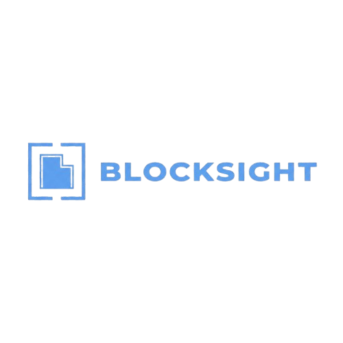
Logo Suite
All logo types available in SVG across brand color variants. Select a color to preview.


Color Palette
Click any value to copy it to your clipboard.
Backgrounds
Background
Elevated
Surface
Text
Heading
Body
Muted
Accents
Green
Blue
Violet
Amber
Borders
Line
Line Strong
Typography
Click a weight to preview the font at that weight. Three font families serve distinct purposes across the brand.
Body text, UI elements
The quick brown fox jumps over the lazy dog
ABCDEFGHIJKLMNOPQRSTUVWXYZabcdefghijklmnopqrstuvwxyz0123456789!@#$%&*()
Size Scale
BlockSight
BlockSight
BlockSight
BlockSight
BlockSight
BlockSight
BlockSight
BlockSight
Headings, editorial content
The quick brown fox jumps over the lazy dog
ABCDEFGHIJKLMNOPQRSTUVWXYZabcdefghijklmnopqrstuvwxyz0123456789!@#$%&*()
Size Scale
BlockSight
BlockSight
BlockSight
BlockSight
BlockSight
BlockSight
BlockSight
BlockSight
Code, data displays, technical content
The quick brown fox jumps over the lazy dog
ABCDEFGHIJKLMNOPQRSTUVWXYZabcdefghijklmnopqrstuvwxyz0123456789!@#$%&*()
Size Scale
BlockSight
BlockSight
BlockSight
BlockSight
BlockSight
BlockSight
BlockSight
BlockSight
Imagery & Photography
Coming soonGuidelines for photography and illustration style.
Style Direction
- Dark & futuristic — imagery should reflect the technical, cutting-edge nature of Web3
- Grain overlay — subtle noise texture used across the brand for depth
- Glow effects — green and blue glow accents on key elements
- Minimal & clean — avoid cluttered compositions; favor negative space
Iconography
We use lucide-react as our icon library. Click an icon to copy its import statement.
Custom icon set — coming soon
Brand Guidelines
Rules and best practices for using the BlockSight brand.
Logo Usage
- Minimum size: 32px height for digital, 10mm for print
- Clear space: maintain padding equal to the height of the logomark
- Do not stretch, rotate, or apply effects to the logo
- Do not place the logo on busy or low-contrast backgrounds
Color Usage
- Green (#4ade80) is the primary accent — use for CTAs, highlights, and interactive states
- Blue (#5b9cf5) is the secondary accent — use for links and informational elements
- Background colors maintain the dark theme hierarchy: bg → elevated → surface
- Ensure sufficient contrast ratios for text on all backgrounds (WCAG AA minimum)
Typography Hierarchy
- Newsreader (serif) for page headings and editorial display text
- IBM Plex Sans for body copy, labels, buttons, and UI text
- IBM Plex Mono for code snippets, data values, and technical content
- Never mix more than two font families in a single composition
Tone of Voice
- Technical but accessible — explain complex concepts clearly
- Confident without being aggressive — data-driven, not hype-driven
- Forward-looking — emphasize intelligence, insight, and infrastructure
- Concise — favor short, direct sentences over long explanations
Templates
Ready-to-use templates for common brand materials.
Business Card
Standard 3.5 × 2 in
Coming soonLetterhead
A4 / US Letter
Coming soonEmail Signature
HTML email signature
Coming soonSocial Media — Profile
400 × 400 px
Coming soonSocial Media — Cover
1500 × 500 px
Coming soonPresentation Template
16:9 slide deck
Coming soon